

If you think coloring books are just for kids, it’s time to spill some beans. The research was conducted at the University of Otago, where participants were assigned the task of coloring logic puzzles. You will have a detailed answer to your query: How do I choose a color palette for my coloring book?
Guess what they found after one week of practice? The participants showed significantly reduced levels of depressive symptoms and anxiety.
So, if you want to feel a bit relieved, why not create a color palette that is perfect for adult coloring books?
Keep reading to learn:
- What is color theory?
- How do I choose a color palette for my coloring book?
How Do I Choose a Color Palette For My Coloring Book?
Choosing colors for an adult coloring book can be both challenging and overwhelming. There are times when you don’t know where to get started.
But don’t worry; we have come up with some methods by which you can choose colors to give you the courage to draw lines on any coloring book.
First, let’s learn about what color theory is.
Color Theory
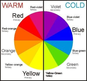
Color theory is a way to understand and use colors. It’s both logical and scientific, as well as philosophical and personal. Think of it like a color wheel, which has three main groups of colors.
Primary colors
Red, blue, yellow (cannot be mixed)
Secondary colors
Purple, green, orange (formed by mixing two primaries)
Tertiary colors
e.g., yellow-orange, red-purple (result from combining a primary with a neighboring secondary on the color wheel)
Color theory helps artists, designers, and anyone who uses colors to choose the right combinations and understand how colors work together to create different moods and effects. It’s like a toolkit for using colors effectively in different situations.
How to Choose Your Main Colors?
You can always refer to the color wheel to find colors that complement each other. Color harmonies are special combinations of colors that work well together, and you can figure them out using this wheel. Here are some types of color harmonies:
Analogous: Neighboring colors on the wheel.
Complementary: Opposite colors that make each other stand out.
Triadic: Three evenly spaced colors for balance.
Tetradic: Four colors, often in pairs of complements.
Square: Four evenly spaced colors form a square.
Split-Complementary: Two neighboring colors and one opposite.
Warm Colors: Energetic colors like yellows, oranges, and reds.
Cool Colors: Calm colors like greens, blues, and purples.
Using these color harmonies can help you make things look visually pleasing, whether you’re painting, decorating a room, or working on a creative project.
How to Choose a Color Scheme
These are the nine key factors that you need to consider for creating a color palette for adult coloring books:
Assess Your Tools
Figure out what coloring supplies you have, like pencils or markers, and see what colors are available. When you start coloring a page, keep your selected colors handy for easy access.
Analogous Colors
If you want control over the mood of your picture, use colors that are neighbors on the wheel. Warm colors, like reds, yellows, and oranges, make it feel cozy, while cool colors, like blues and greens, give it a calm vibe.
When using analogous colors (3-4 shades from one side), your picture looks harmonious. To add excitement, vary between lighter and darker shades. This contrast brings vibrancy to your artwork.
Complementary Colors
Using complementary colors in your palette can be challenging but rewarding. They create the contrast that makes elements stand out, but if overused or mixed, they can lead to a messy look.
A useful approach is to let one color dominate the picture and use its complement for details. When done well, this can make the main part of the picture pop beautifully.
Get Inspired
Look around you for color ideas, like in nature, on TV, online, or in magazines. You can capture or bookmark photos featuring colors you find appealing.
Online platforms like Pinterest offer a vast array of pre-made color palettes, with sites such as Colour Palette, In Color Balance, and Design Seeds providing collections complete with images and color swatches.
Limit Your Palette
Using a limited number of colors in your artwork can make it look balanced. Even if you don’t have a set color palette at first, you can create one as you go by blending the colors you already have.
You can reuse colors in different parts of your picture to keep it balanced and harmonious. For example, in one picture, you started with a few pencils and blended them to make more colors.
In another picture, you used many colors but repeated some in different areas to create balance and harmony.
Incorporate Neutrals
Having only neutral colors in your palette might make your picture look boring. But adding one or two neutrals to your colors can be a good idea.
When you put a neutral color next to a brighter one, the bright one stands out more.
So, if you’re using vibrant colors like blues and greens, adding cream, gray, or brown can make those colors look even brighter.
Neutral colors include cream, tan, white, brown, gray or black. They make your picture more attractive and add depth to it.
Make Swatches
A color swatch sheet is a reference tool where you sample and record chosen colors for your palette on paper.
It helps you see how each color truly appears before applying it to your artwork.
Multiple swatches, including light, dark, and layered variations, allow you to test and select the right colors for your coloring project, ensuring they match your vision.
You can create multiple color swatches for each color you’ve picked. Begin with a light swatch using one layer of color. Then, make a darker swatch.
You can also try an even darker swatch and add a second layer on top. These swatches help you see how colors will appear in your picture and allow you to use them as desired.
Do Tutorials
Tutorials from artists you admire can be a great way to learn coloring techniques. Look for tutorials on YouTube, Facebook coloring groups, and Instagram.
They come in various styles and difficulty levels, from step-by-step narrations to technique demos set to music. Exploring these resources can help improve your coloring skills and color choices.
Have Fun
Coloring is about relaxing and expressing yourself, so don’t stress. Experiment with different color schemes to see what you like.
Remember, coloring should be enjoyable, so choose colors that make you happy and fit the mood you want for your artwork.
Here’s a helpful tip: If you’re going to take more than one session to color a page, don’t put your colored pencils back in their box each time. Instead, use a rubber band to keep them together. This way, they’re ready for you when you come back to continue coloring.
Conclusion
You know, creating a color palette for adult coloring books has really taken off, and there’s a good reason for it! It’s a simple thing, just coloring, but it’s surprisingly great for reducing stress. Some folks even think of it as a form of meditation.
It’s not just relaxing; it’s like a brain break after a busy day, and there’s no pressure to be super creative – you just go with the flow!
We hope this article helped you with: “How Do I Choose a Color Palette For My Coloring Book?”
Links To Related Articles
Coloring For Adults 101: A Beginner's Guide
Ready to dive into adult coloring? Coloring For Adults 101: A Beginner’s Guide has everything you need to know to start coloring today! Discover color theory, coloring techniques, the best coloring supplies, the incredible health benefits of coloring, and sign up to get your FREE COLORING PAGES!
Coloring Challenges and Prompts For Adults
Who says coloring is just for kids? Prepare to embrace your creative side with our curated collection of Coloring Challenges and Prompts for Adults. Get ready for an artistic journey filled with inspiration and imagination. Click here to explore color challenges and how they can benefit you!
FREE COLORING PAGES!
Sign up here to get a collection of some of our favorite printable coloring pages for free! Unsubscribe at any time.